The big-data successor of the spreadsheet
11-4-2015

In my previous post, I argued that because spreadsheets do not scale to big data proportions, we need a new mode of computation that is as powerful but (more importantly) also just as accessible. So what could that successor of the spreadsheet look like? The question has kept me busy for quite some time, but of course I am not the first to ponder this issue. Let’s focus on the problem of information retrieval, or querying, for now.
Back in 2011 I designed an analysis tool for big data, based on MongoDB and Node.js. The key concept was that of a drag-and-drop data pipeline. The back end would transparently convert the pipeline into a series of MongoDB queries (or Map/Reduce operations), execute them, and display the results. A few days ago, I came across TaskPipes, which implements something similar.

Briefly after I started working as a consultant at Dialogic, I designed an improved version of the system, using puzzle pieces (based on Google Blockly) to represent logical data operators. This interface is more declarative than the procedural ‘data pipe’ I used earlier: you tell the system what you want it to calculate, not how. The puzzle pieces found success among fellow consultants/researchers, but primarily among those who were already used to typing formulas like this in Excel.

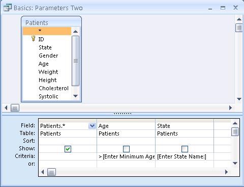
From both exercises, I learned that flexibility and room for experimentation is critical in data analysis, because ultimately it leads to new analysis ideas and a much better end result. One of the things I also learned is that even though interfaces like the above are immediately obvious and easy-to-use for computer-minded people like myself, they are not as intuitive for the average spreadsheet user. Just take a close look at the pictures above. The interfaces require the end-user to know about the concept of a table, rows and columns, the concept of logical expressions, as well as aggregation, even though none of those are directly visible nor have a ‘real life’ analog.
What if you could query big data by just showing the computer an example of the kind of result you are looking for?
Querying big data sets for non-programmers is a bit like being a tourist in a foreign country where you don’t speak the language. So much to see and do, but how? What do you do when you are looking for something? You start to use gestures and perhaps pictures and sketches to show the natives what you are looking for. What if we could query big data not by talking to the computer in its language, but simply by showing the computer an example of what we are looking for?

Already during the mid-1970s, researchers at IBM conceived query by example, a way to query data sets by simply showing the system an example of a result. Query by example works great for filtering items from a large data set. Excel’s Pivot Tables, which lets you move column labels to the place you want them to be in the end result, and so with a bit of imagination is also query-by-example, show that it can also be used for aggregations. Its macro recording feature arguably is also ‘by example’, but is too specific. For more complex analysis, query by example becomes less intuitive and useful.
A different implementation of a by-example user interface is Soulver. Soulver is a scratch pad for making mathematical calculations. After you’ve written down your calculations, it allows you to change all numbers afterwards, and a new result is calculated automatically. Again, you show the computer what you want it to do once, after which it can repeat the same thing an infinite number of times.

What if we had an interface that looks and acts like a regular spreadsheet, yet attempts to continuously and transparently generalize the user’s actions to algorithms?